We’re using cookies, but you can turn them off in Privacy Settings. Otherwise, you are agreeing to our use of cookies. Accepting cookies does not mean that we are collecting personal data. Learn more in our Privacy Policy .

design system

In these pages you will find guidelines and documentation about our code and examples.

design system

In these pages you will find guidelines and documentation about our goals and standards.

overview

These pages show our brand styles and basic usage across the site.

overview

These individual components can be placed nearly anywhere on the site.

overview

These page templates put the styles and components together into examples that will be used for the live site.

Data Privacy

As a global organization, CFA institute must comply with the EU’s General Data Protection Regulation (GDPR). GDPR will be actively enforced beginning 25 May 2018. CFA Institute is applying GDPR requirements to all CFA Institute audiences unless the Global Data Privacy Officer determines that there is clear evidence that a resource is not intended for or used by residents of the EU.

GDPR specifically protects person-related data of an identified or identifiable individual, including

  • Identifying information such as name, address, and ID numbers
  • Location, IP addresses, and cookie data
  • Other protected data such as racial or ethnic data, political opinions, sexual orientation, health, genetic, and biometric data

As provided in the CFA Institute Data Protection by Design and Data Protection Impact Assessment Policy and Procedure, an assessment of personally identifying information use must be conducted as part of kickoff activities for every new project at CFA Institute.

All vendors who handle individual personal data for CFA Institute are required to be in compliance with GDPR unless otherwise approved in advance by the Global Data Privacy Officer and the Chief Information Security Officer.

Informed Choices

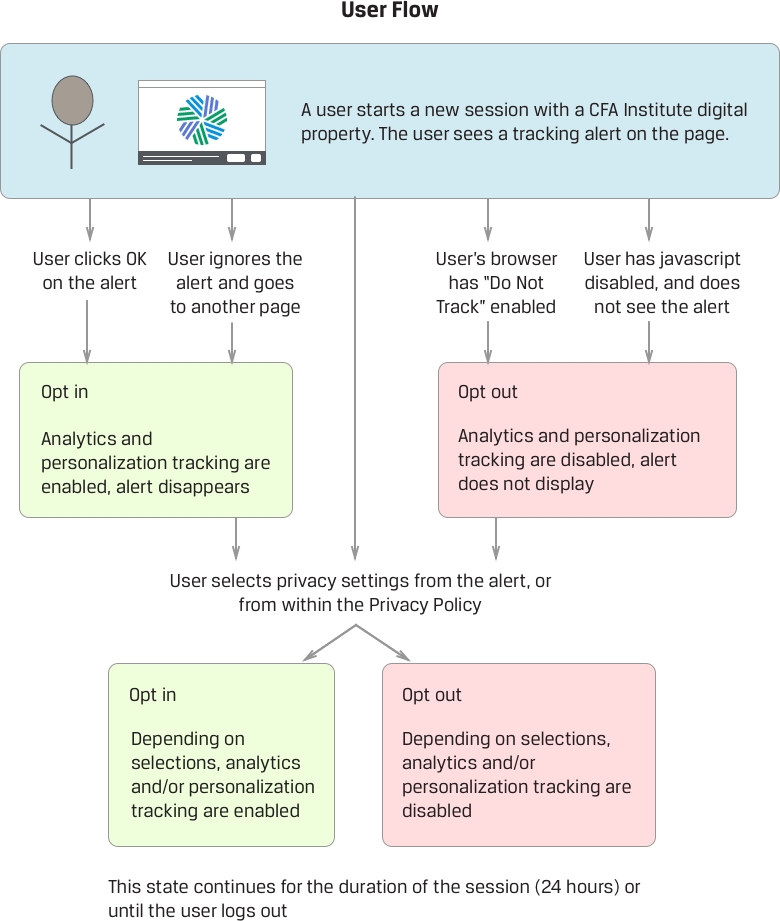
Requirement: Tracking Alert

Users must have a clear understanding of the kinds of tracking a site engages in. Consent to tracking must be “freely given, specific, informed, and unambiguous.” Users must be able to opt out of non-functional tracking at any time.

What We're Doing

Upon accessing a CFA Institute site, users are shown a tracking notification. The user must be allowed to opt in or out of tracking at every new session. For the purposes of GDPR, we are treating a session as 24 hours.

The user can

  • Ignore or close the notification, which is treated as opting in to tracking
  • Select a button which allows them to control specific privacy settings

If the user’s browser is set to “Do Not Track,” this is treated as opting out of all tracking, and the user is not shown the notification. If the user’s JavaScript does not load, the user cannot see the alert, and is treated as having opted out.

The Privacy Settings control clearly explains the difference between the different types of tracking and lets the user choose which to allow. If a specific type of tracking is not present, the user does not need to be asked to opt in or out of it.

  • Functional tracking. Tracking or cookies that are necessary for basic site functionality are always allowed, but the user must be made aware of them
  • Analytics tracking. The user should be able to opt in or out of analytics
  • Personalization. The user should be able to opt in or out of site personalization

The Privacy Settings control is also available at all times from the Privacy Policy page.

Flow diagram describing what happens when a user makes various choices regarding analytics and tracking.

Transparency

Requirement: General Privacy Policy

Users will be able to review a general description of the types of data we collect and what we do with it.

What We're Doing

The data inventory will be added to the Privacy Policy, and users will be directed to view it.

Requirement: Right of Access

Users can request an inventory of the types of data we have collected specific to that user. This will produce an inventory of the data types only, not the specific data values. For example, the right of access will tell a user that we have captured their mailing address, but not what the mailing address is.

What We're Doing

If a user requests access to the types of data we have stored for them, we will provide it. Requests will be channeled through the Global Contact Center, and users will receive either a response within 30 days, or an update explaining that the process may take an additional 30 days (for 60 days total).

Requirement: Right of Portability

Users can request a copy of all data (types and specific values) that they have previously provided to us.

What We're Doing

All requests for "data portability" will be channeled through the Global Contact Center, and users will receive either a response within 30 days, or an update explaining that the process may take an additional 30 days (for 60 days total). Data will be pulled by IT Ops, and the request will be reviewed by the CFA Institute Global Data Protection Officer, who will sign off. The user’s information will be sent to them on removable media.

Some information is confidential and cannot be shared.

Requirement: Right of Rectification

Users can request for incorrect data to be rectified.

What We're Doing

All requests for data rectification will be handled by existing update procedures (I.e., self-service through the online / mobile sites or through the Global Contact Center). Users can remediate most of their current data through the Account dashboard.

Requirement: Data Breach Notification

All data breaches must be reported to Supervising Authorities. Users must be informed of a data breach within 72 hours if it results in a high risk to their rights and freedoms.

What We're Doing

See the Incident Response Plan for details.

The Right to Be Forgotten

Requirement: Data Deletion

Users can request deletion of personal data.

What We're Doing

All requests for data deletion will be channeled through the Global Contact Center, and users will receive either a response within 30 days, or an update explaining that the process may take an additional 30 days (for 60 days total). Data will be pulled by IT Ops, and the request will be reviewed by the Data Protection Officer, who will sign off on what can or cannot be deleted. The actual "deletion" will take place by anonymizing the data in the system such that it cannot be tied back to the original person. The user will then be informed of the completion of the anonymization.

Some types of data may not be deleted (e.g., exam results or professional conduct records), including data that proves we are following GDPR regulations.

Good Data Management

Requirement

Don't gather excess data. Unused data should be deleted.

What We're Doing

In general, requests for personal data should be minimized.

Front End Dev Principles

General Approach

  1. Progressive Enhancement

    Content is king; make sure it loads above all else. Then make it visually approachable. Then make it interactive.
  2. Reusability

    Build patterns to make coding easy and brand consistency will happen automatically.
  3. Responsive Design

    Start by thinking about smaller screens, and grow from there. Be responsive, create adaptively.
  4. Prototyping

    The best way to see how a design works is to build it.
  5. Communicating

    Not sure what pattern to use? Need a new pattern? Something doesn't seem quite right? Let's talk about it!
  6. Technique

    Consistency isn't just for branding. Adhering to coding standards can help everyone.

Progressive Enhancement

Writing the code for beautiful designs and interactions is fun, but in the end people visit most sites to gain information. In this light, it is key that the information given by a page is accessible to a wide audience and not hidden behind fancy styles and javascript. You can never have 100% control over the client's abilities, and so it is important to deliver content from the ground up with a strong foundation. If nothing else renders but HTML, it will still be readable, accessible and functional if semantic HTML is used.

There is an assumption with many people that progressive enhancement means you aren't allowed to do the fun stuff, too. This is not true! The important thing to remember is that you are starting with a strong foundation on which to build upon. Once you have that, it is much easier to work with css and javascript, because you have the node structure created already. All you need is to consider the amount of time required to create each layer.

What to Consider:

  • Which parts are absolutely necessary for the end user?
  • Which are pure design choices?
  • Can performance be enhanced by moving some things to the back end?
  • Am I using HTML elements that make sense for the content inside of them?

Reusability

Reusability is all about efficiency, and is one of the main reasons we have created this library. It means that we can always be sure what something will look like. It means that we maintain branding consistency. It means that we can make needed changes in one place, and all of our properties will be updated.

It also means that our front end code is easy to use, for developers and non-developers alike. A dev who needs to add a certain component can simply copy and paste the code into their application. A business representative who wants to know what their content will look like can simply look at an example to get an immediate idea of what to expect.

Because we are always updating and changing, this component library is a living document and sometimes we will need to create new patterns. When developing interfaces, have an eye towards reuse. Unless the use case warrants a new pattern or collection of fields strive to use the same markup across applications in such a way where an update to the pattern only needs to be made once.

What to Consider:

  • Have I seen something like this before?
  • Can we use an existing pattern to do this?
  • Where else could we use this new pattern?

Responsive Design

We can't predict what devices or input types our stakeholders will want to use to interact with our interfaces, so we support all devices and input types (keyboard, touch, mouse). Because mobile devices are growing as a primary interface across the world, we use the mobile-first approach to streamline layouts and tasks.

Planning for a small screen and assuming the components will expand to fit can make development easier. Often times a component coded for a small screen will look just as good on desktop sizes. It also means that by default, we'll have a decent layout even for older browsers. We aim to support all browsers, but we optimize for the most recent versions.

Additionally, by writing semantic code and styling for minimal devices, we help ensure that we meet accessibility guidelines. HTML supports content by providing context. Styling supports that content by giving it visual context, and we use relative units, particularly "rems" to make sure that no matter the screen size or zoom everything fits as intended. All functionality should be achievable without the need for javascript, which may not be accessible with some devices or in some locations.

What to Consider:

  • Does this design take into account smaller devices?
  • Is my HTML semantic?
  • Does my code pass accessibility standards?
  • Have I tested my code in multiple browsers and devices?

Prototyping

Rather than depend solely on static images, wireframes and written documentation to determine how a component should be built, we prefer to prototype as much as possible. While imagery is a good start, it is easier to understand the limitations and effects of what we can do with functional code. Particularly with non-developers, having a hands-on demonstrable piece of work helps to show technical limitations visually.

Creating prototypes also helps to speed up work. After creating something basic, you have already created the foundation of the component. Even if tweaks are needed, with a prototype already made it is easy to put that code into place.

Prototyping can be done in many environments. Creating something in an existing code repository would be an obvious choice, because it will already be connected to our library. However, creating something from scratch in Notepad or even just adjusting styles live in a browser's dev tools can be useful ways to demonstrate requested changes and their effects on other page components.

What to Consider:

  • Will creating a prototype help illustrate the problem?
  • What requirements need to be completed?
  • What resources will a proof of concept require?
  • Is my code testable?

Communicating

Because front end code is what drives the visual aspects of our web properties, it is often the most commented on for desired changes and updates. Because of this, we need to be able to communicate well not only with other developers but with business partners and our user base to better understand their needs and to explain our reasonings. We also do our best to keep in contact with other teams to stay on top of updates and future work, to help make better solutions and estimates of time required to deliver.

It is also common that new developers or developers unfamiliar with fron end code will have a need to use our work. In that vein it is important that we document as much as possible. We have tried to make this library a useful tool for everyone in the business to use in one way or another. It is also important to us that our code is readable and understandable, and so writing clearly and using helpful comments in code is key.

Finally, because the component library is our source for all styling and scripting and front end is a "shared service", it is important to make everyone aware when changes are coming. Nobody likes to be surprised at an inopportune time. We are all part of the same team, so let's work together as much as possible!

What to Consider:

  • Have I made my changes clear to all teams?
  • Have I communicated any red flags?
  • Does my code include readable comments?
  • Is my component documented in the library?

Technique

In addition to commenting, we try to adhere to a few other coding standards as well. This helps ensure that code is consistent from one team to the other, and helps to unify everything into a single entity. Here are some things to look for:

HTML

  • HTML elements should make sense with the content they contain.
  • HTML should never be used solely for layout.
  • Element names and attributes should be written in lower case.
  • Use aria attributes where necessary for accessibility, but know that they are not always needed.
  • ID's should be used when a unique link or javascript connection needs to be made. They should be written "inCamelCase"
  • Classes should be used for styling, less often as javascript hooks. They should be written in lower case.

CSS

  • CSS is powerful, use it wherever possible in favor of javascript.
  • Avoid targeting elements specifically. Use classes wherever possible.
  • Class names should be meaningful to their purpose.
  • When writing large batches of rules, alphabetize the rules for easy findability.
  • When using SASS, don't nest more than two levels in.

JavaScript

  • Write as little code as possible.
  • Write as many comments as necessary.
  • Target nodes via their ID if possible.
  • Avoid using third party plugins whenever possible.
  • Test test test!

General

  • Indent your code for readability.
  • Add comments to clarify your code.

Conclusion

But you should strive for it anyway, and don't be afraid to ask for help!

Inclusive Design

Inclusive design is a win-win for both our users and the organization. It expands our product’s reach, sparks innovation, and helps CFA Institute take on a position of social responsibility.

Inclusive design is a process, while accessibility is a goal. The job of inclusive design is to make sure experiences are truly open to all.

Accessibility — making sure our digital products are fully usable by people with disabilities — is one of the core objectives of inclusive design, but it is not the only one. We try to ensure the digital products we deliver are inclusive by following best practices such as progressive enhancement. Progressive enhancement is a “content first” design strategy where we make the content available to all regardless of any technology constraints, and then we layer on the styling and interactivity… all the while also following accessibility guidelines.

Accessibility in technology often means ensuring people with disabilities are included, and that certain legal compliances are met. However, an inclusive product means that it’s usable by as many people as possible, including those with disabilities.

Removing a barrier for one person can make a website better for everyone. For example, captions allow a video to be watched in a noisy environment. Keyboard-only navigation makes a website easier to use for someone holding a baby. Good text contrast means a page can be read in bright sunlight. Audio books were originally intended for blind people, but now they’re enjoyed by people of all abilities. Everyone benefits when barriers are removed.

Accessibility and Inclusive Design

Accessibility Quick Checks

UX Principles

General Approach

  1. Research

    What problem(s) are we trying to solve? What are we building? What data do we have to help understand the problem? Do we have customer feedback to support the project?
  2. Plan

    Do we have specific user stories? Create user flows to better understand the journey, and make sure you validate using audience data. Define red routes to help identify, prioritize, and eliminate obstacles.
  3. Explore

    Discuss the project with peers. Prototype, prototype, prototype, and test your prototypes with real users. Be prepared to throw away most of what you make. It’s much cheaper to rework your approach at this stage. Work with the content team and use real content at this phase.
  4. Create

    Is this responsive? What does it look like on mobile? Tablet? A large monitor? Reuse existing elements and patterns. Follow style guidelines. Follow WCAG 2.1 AA guidelines.
  5. Feedback

    Be specific and clear with error messages. Give immediate feedback of successful actions. Show a loader if users must wait.
  6. Finalize

    Use images, icons, and colors consistently. Always follow the design guide and try to keep things clear and simple. The design should always provide the user a clear path forward... not distract.
  7. Delight

    Add micro copy where appropriate. Think about micro interactions. Will motion help build meaning about spatial relationships, functionality, and intention?
  8. Analyze

    Can we user test? What KPIs will we look at for success? What do we expect to achieve? Are data collection measures in place? Can we show efficiency gains (e.g. time on task)?

Define the Problem

While it can be tempting to jump straight into designing a solution, it’s essential to make sure the right problem is being solved. Nothing is more costly than building the wrong thing.

Problem definitions should be based on data, not opinion. Analytics, journey mapping, and qualitative and quantitative data gathering techniques are valid ways to confirm that a real problem exists.

Make sure your problem statement is correctly sized. It should be broad enough to allow for creative solutions, while narrow enough to constitute a single, solvable problem. Prototyping and hypothesis testing can help confirm that you have identified the right problem to solve.

Content-First Design

Content should form the foundation of all design decisions. If we design in the absence of real content, we are creating the packaging before we know what’s going in it.

Start with Content

Design the user flow first. This allows us to identify pages and content needs. Think about strategic objectives and red routes during this process.

Wireframing

Map the user flow to the wireframe. By working content-first, we can prioritize the wireframe development accordingly:

  • Content structure
  • Interaction design
  • Visual design

Iteration

Iterating on the interactions through low-fidelity wireframing will help us better understand and control the flow of the experience. As you work keep the following in mind:

  • Real Content. Use real content, never use “lorem ipsum” or placeholder content.
  • Collaborate. Involve the content team often as the wireframes evolve.
  • Test. Test your wireframes with real users as frequently as possible.
  • Progressive Enhancement. All core content needs to be accessible on all devices.
  • Think Mobile-First. Make sure we adequately represent what pages look like on mobile. Ideally, start making content and interaction decisions at the mobile breakpoints before designing the desktop experience.

Progressive Enhancement

Progressive enhancement means one thing: delivering what can be supported to the right platform. It’s not about supporting the oldest browsers. It’s not about avoiding JavaScript. It’s about making sure the core content is always accessible. We progressively enhance in a layered approach. Once we design the content layer, we enhance by adding the design and interaction layers independently.

Layer 1: Content

The first layer is clean, semantic HTML. This allows text-based, speech-based, antiquated and robotic user-agents to navigate the content of your website properly. Semantic HTML will take you 90% of the way to a site that works with most assistive technologies.

Layer 2: Design

The second layer is CSS. This allows visual-based user-agents to display or alter the visual representation of our website’s content.

Layer 3: Interaction

The third layer is JavaScript. This allows user-agents that are capable to provide users with enhanced features and usability.

Interaction Design

Good interaction design is driven by a human connection.

Goal-Driven Design

We need to understand our users and design solutions for them. Our design approach should be people-centric and inclusive. Personas, user scenarios, experience maps are all tools to help us focus on the user.

Usability

Usability is the bare minimum of interaction design. A system must first be usable before it can be enjoyable. We want our systems to be effortless to use.

Affordances and Signifiers

Make things obvious. Without signifiers (e.g., blue underlined links), users won’t be able to perceive what they can do.

Learnability

We use consistent UI patterns that will be familiar to our customers. Our component library contains components that provide a strong level of predictability.

Feedback and Response Time

Feedback is the heart of the interaction. Micro-interactions and subtle animations, in response to a user’s action, will provide satisfaction and a sense of accomplishment. If a process takes too long to complete, we should provide the appropriate feedback to the customer (like a loading icon).

Performance

The faster a site loads, the better the user experience. A few things that we must do to assure a fast-loading site are:

  • Minify and concatenate all JavaScript and CSS
  • Make sure all images are properly optimized
  • Include CSS at the top, JavaScript at the bottom
  • Avoid using unnecessary images that don’t add value to the page
  • Avoid plugins unless necessary (most plugins are bloated and add HTTP requests)
  • Create animations using CSS instead of JavaScript

Image Optimization

All production images should be properly optimized. ImageOptim is a great tool for providing lossless compression and removing bloated metadata. Online optimizers include tinyPNG and Jpeg.io.

HTML

When writing HTML, strive to be semantic, concise, and effective.

  • CSS references should be placed at the top of the document.
  • JavaScript references should be placed at the bottom of the document.

Reduce HTTP Requests

Eliminate any features that do not improve the user experience. These may be:

  • Unnecessary images
  • Unnecessary JavaScript
  • Excessive CSS
  • Unnecessary plugins

Web Writing Guidelines

This guide contains a short list of the preferred CFA Institute editorial styles. For a more complete list of web writing and editing, please consult the CFA Institute Digital Style Guide.

Dates

  • All dates on the website should follow the global date style: 22 May 2013 (day month year or day/month/year).
  • Do not use a zero before days.

Times

  • AM and PM should be uppercase.
  • Include a space between the numeral and AM or PM.
  • Hours should be written out (e.g., 9:00 AM, not 9 AM).
  • On the website, we usually refer to just the Eastern Time Zone as “ET” and do not reference daylight savings or standard time.

Numbers

  • Numbers one through nine are spelled out in text.
  • Numerals are used for 10 and all higher numbers up to 1 million.
  • If it is the first word in the sentence, always spell it out.

Currency

  • Currency will be listed as currency type (using ISO currency codes), followed by a space, followed by amount.
  • When in paragraph form or being used for marketing purposes and when the amount is even (no change), it is not necessary to include the decimal point and cents. For example: USD 849